
All organisations have one particular concern in common: proper allocation of finite resources. The difference between doing this right and doing it wrong is boom and bust. This concern touches all aspects of business, but none more so than procurement.
With the rise of globalisation, supply chains have swelled into unruly and often unmanageable beasts. The modern organisation is under contract with more suppliers than ever before. McKinsey reports that the average auto manufacturer deals with 18,000 suppliers; aerospace manufacturers 12,000; and tech companies 7,000.
All of these suppliers indicate a relationship that needs to be managed. But with limited time, staff and finances, not all vendors can (or should) receive the same attention. Dedicate too little of your resources to a supplier of a core product, and you put your entire company at risk. Dedicate too much of your resources to what is essentially a transactional category (more on that later), and you won’t have enough left over for the vendors who require more attention.
The question: how do you know what resources to dedicate to each supplier?
The answer: with ProcureTRAK’s Complexity Assessment & Opportunity Analysis dashboards.
Get an objective eye on your categories
From within a company, it’s hard to get a good idea of the resources each supplier category deserves. All category managers think their category is the most essential. Similarly, the products or services that a company doesn’t spend much money on get little to no attention (even though the amount spent on a category doesn’t give a good indication of how core it is to the business).
What every organisation needs is objectivity. ProcureTRAK’s Complexity Assessment & Opportunity Analysis dashboards organise a business’s supplier base based on how much and what sort of attention each category needs.
Three streams of data go into these dashboards:
- A thorough spend analysis, including identification, collection, cleansing, classification and analysis.
- A survey of all contract managers, involving questions such as:
- What is your impression of the market:
- What is the supplier concentration?
- What are the number of stakeholders?
- What are their preferences?
- Our own knowledge and experience of relevant markets gleaned from working with similar businesses.
Let’s take a look at what each dashboard can tell you about your supplier base.
The dashboards
Category Complexity Segmentation
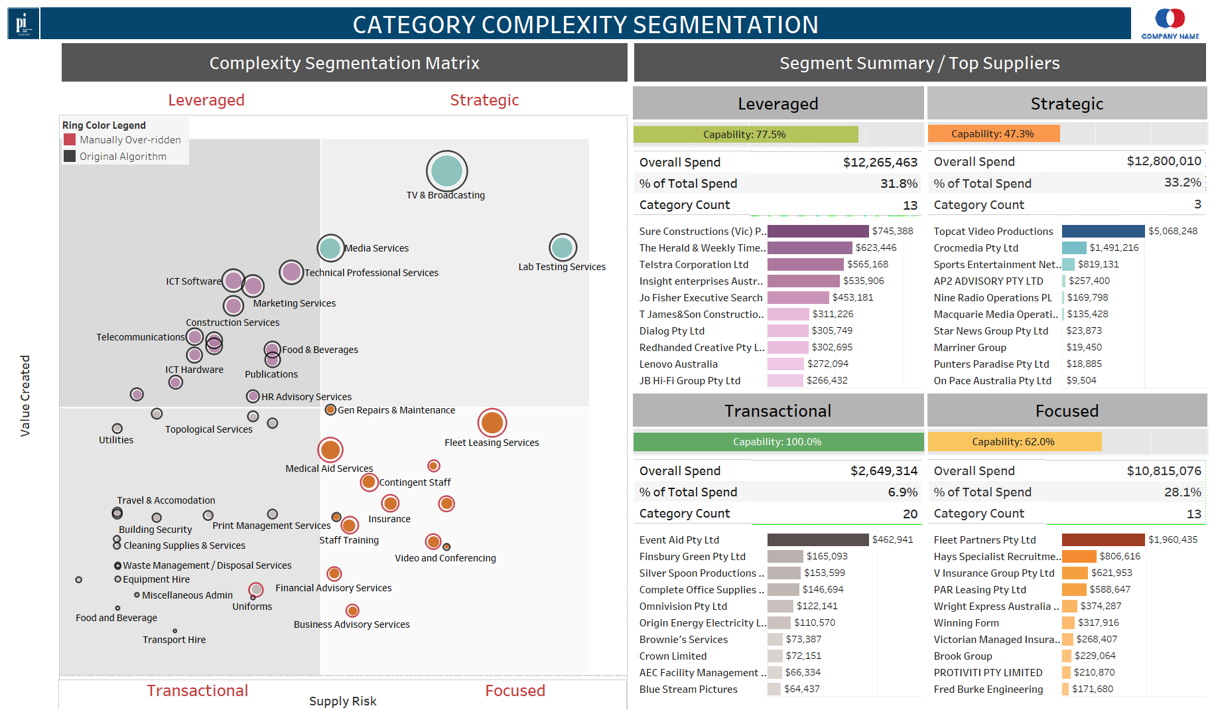
This dashboard uses the well-known Kraljic Matrix to organise your suppliers into quadrants. The quadrants are:
- Leveraged: this quadrant includes categories in which a company spends a lot of money, and the market is flush with suppliers.
- Strategic: this quadrant includes categories in which a company spends a lot of money, but the supplier market is small.
- Focused (bottleneck): relatively small amounts of money are spent on the categories in this quadrant, but they are nonetheless core to the business.
- Transactional: small amounts of money spent on non-core products and services (stationary, utilities, etc.)
In which quadrant the category lands determines how the supplier or the approach to market is handled. If it’s strategic, that means it’s core to your business and there aren’t many suppliers out there, so you need to develop long-standing partnerships and lock in prices.
If, on the other hand, it’s transactional, you want to spend as little resources on it as possible. The Kraljic Matrix gives you a good understanding of the value the product or service you are buying has for your business.
Opportunity Wave Plan
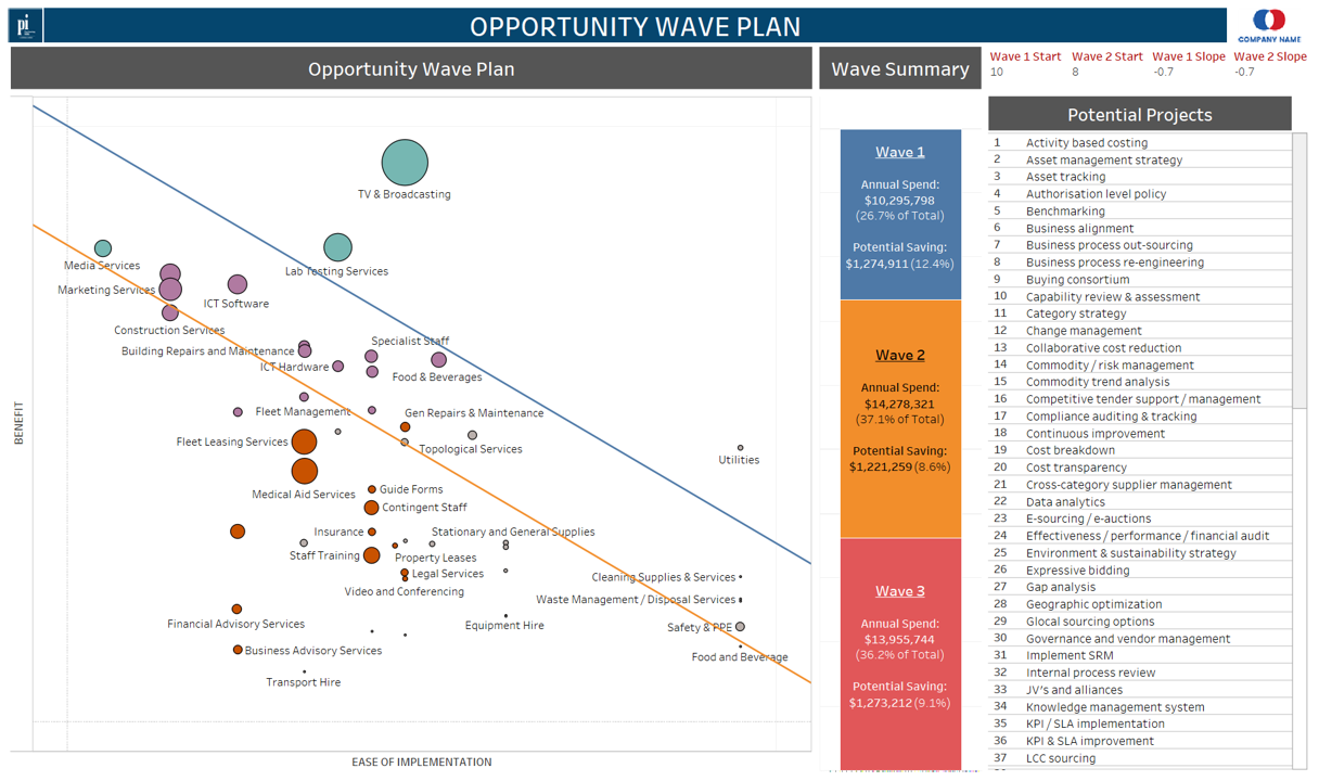
Now we know the approach to take with each category, it’s time to think about ease of implementation. Dealing with finite resources, we need to pick our battles. Not every category can be optimised, so which ones are most practical and offer the most potential for savings?
The Opportunity Wave Plan dashboard answers these questions clearly and concisely. On the vertical axis, we have the Benefit of optimisation. On the horizontal axis, we have Ease of Implementation.
Simply put, the higher up a category is, the more savings there are to be made. The further right it is, the easier those savings are to achieve.
This dashboard, however, goes one step further. Click on any category, and you’ll see a list of potential levers you can pull to achieve those savings. For instance, the dashboard may suggest Buying Consortium, Vertical Integration, Implement SRM or numerous other potential projects based on the category and the unique aspects of your organisation.
Know what’s practical, and how to achieve it.
Supply/Demand Analysis
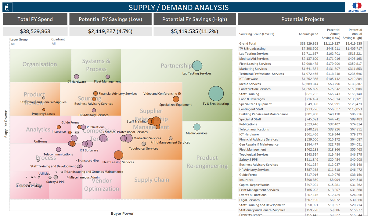
Where does your power sit in relation to the supplier’s? This is an important question for all procurement officers, and the answer determines how you manage that category.
The Supply/Demand Analysis dashboard posits your categories against axes of buyer power and supplier power, and further organises them into three groups: pink, orange and green.
Pink – Control: categories which need to be brought under control. Usually comprised of tail-end purchases that no one looks twice at, to the company’s detriment.
Orange – Optimise: these categories need to be optimised from a strategy point of view.
Green – Transform: the organisation thinks these categories are being managed well, but analysis shows there are still things to be done.
Discover where your resources are best directed
ProcureTRAK’s Complexity Assessment & Opportunity Analysis dashboards have the potential to transform your procurement function. With objective spend data analysis and rigorous surveys, we can show you the importance of each category, how much can be saved from optimising it, and how easy that is to achieve.
Get in touch with the gurus at Purchasing Index today, and start putting your money where it’s best spent.